I shot some really pretty footage of the palm trees in front of my house today with a 135mm lens. I love how they came out and I just finished editing them together to make up the 'credits' portion of my short. I also went through the entire timeline and added some jump cuts and crossfades to connect shots together, and I'm happy with how those transitions came out. In addition, I mixed the audio for all the footage I have too, and I think the volume levels of the background noise and music are balanced well. All I need to do is get the car footage for the beginning and I'll be done besides credits, which is what I'll mainly be discussing in this post.
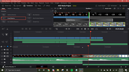
Here's me working on a crossfade.
Anyways, it's time to think of a good font for my credits. The footage I'm placing them over looks like the screencap below for the most part, so I want to go for something with a strong contrast to break through the patterns made by the leaves.
For placement I already know I want to fill up the negative space between the leaves, so all I really need to figure out is fonts. The first thing I want to do is look at my main inspirations and see what types of fonts were used there. I didn't even realize this until looking back at some of my favorite films' opening credits but a lot of them feature landscape or nature shots with text over them; I guess that was a subconscious inspirational move on my part, but it also helps in deciding on text options now. The examples I looked at use sans-serif fonts, almost always white, sometimes with a shadow to distinguish further from the background, so I think I'm going with something like that.
(That fourth example is probably what my credits are gonna look like LOL)
It's worth noting that one of my favorite uses of text in an opening is the one for
Gummo (third example): I love the contrast between the more contemporary slim bold sans-serif and the red blackletter in lowercase. Maybe I'll incorporate a second, more elaborate font as a dedication.
With all this brainstorming, I think I'm going to use a white sans-serif font in all lowercase to fit the contemporary teenage relatability I want to create in my opening. I'll add a shadow to contrast the sky blue background and put the text in the negative space between the leaves in my shots. The main fonts I'm considering on Adobe Fonts are the Trade Gothic Next family and Vinyl OT Regular. I'll try out both on top of my footage and see which one works best.


No comments:
Post a Comment